THREE BRIDGE
Repositioning a consultancy to sustain rapid growth.
The Challenge
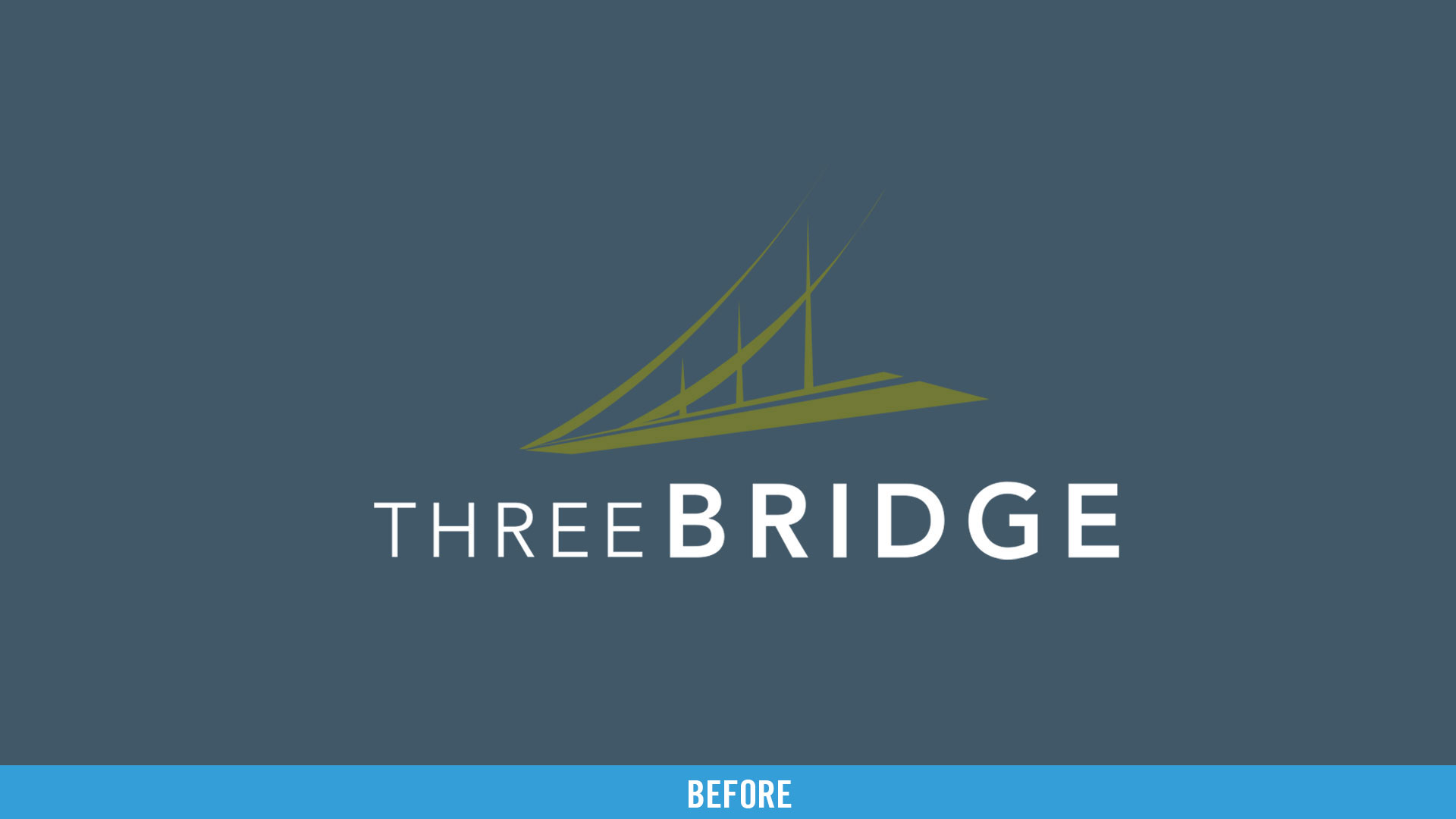
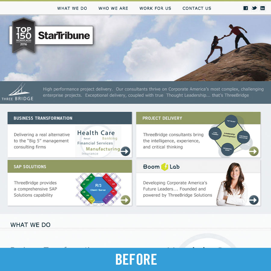
ThreeBridge is one of the largest consulting companies in the Midwest, but their existing brand identity, messaging, and website did not communicate their Fortune 500 expertise, differentiate them from their competitors, or represent their vibrant company culture.
The Solution
Create a refreshed brand identity that defines the organization’s overall brand architecture and supports its growth and expansion goals, conveys ThreeBridge’s deep expertise, and reflects their culture to attract and retain the best and brightest team members.
The Need: Brand Alignment & Purpose Clarity
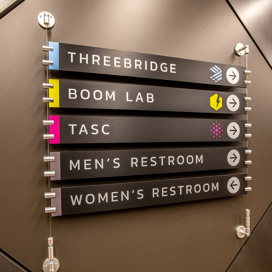
ThreeBridge offers thought-leadership, training, and consultant talent to large corporate clients. The organization’s junior consulting training division, Boom Lab, had launched very successfully. With a different visual look and conflicting messaging, ThreeBridge’s brand did not align with Boom Lab, causing confusion in the market and lacking internal clarity for implementing future brand extensions.
Our Findings:
Strength: Clarity of Vision
ThreeBridge had established itself as a top 5 firm recognized for staffing capabilities and SAP Solutions in the Twin Cities. The organization had articulated its vision to become the go-to partner and trusted advisor for clients. Leadership inspired a strong desire to be a company where the consultant, the client, and the company are equally valued and respected.
Opportunity: Limiting Brand
Following several years of success, ThreeBridge was poised for rapid growth but the current brand was holding back their perception in the market. It did not support fast-paced growth strategies, communicate expanding service offerings, or communicate its mission to employees.
The Strategy: A Brand As Focused On Its Employees As Its Clients
Most organizations have a singular mission statement. For ThreeBridge to differentiate, they needed to articulate their promise to clients and employees.
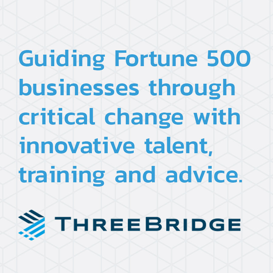
Client Mission: “ThreeBridge will provide unequaled value through creative solutions, high-quality delivery, thought leadership, and exceptional service.”
Employees Mission: “ThreeBridge will provide lasting careers that include challenge, variety, development, and success.”
With these missions, ThreeBridge is now positioned as the modern alternative to larger national and global consulting firms.
Guiding Critical Change
Visual Identity and Brand Architecture
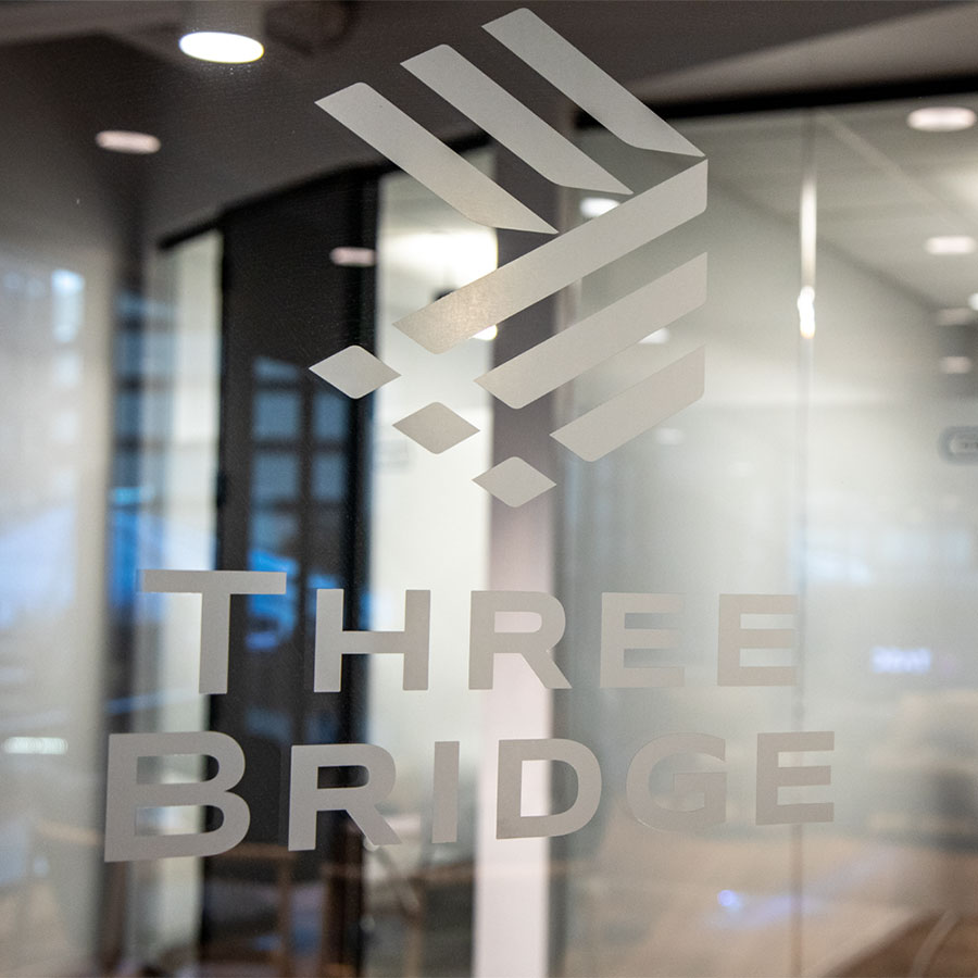
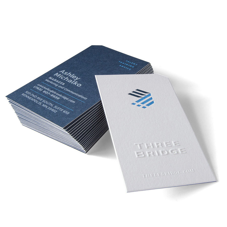
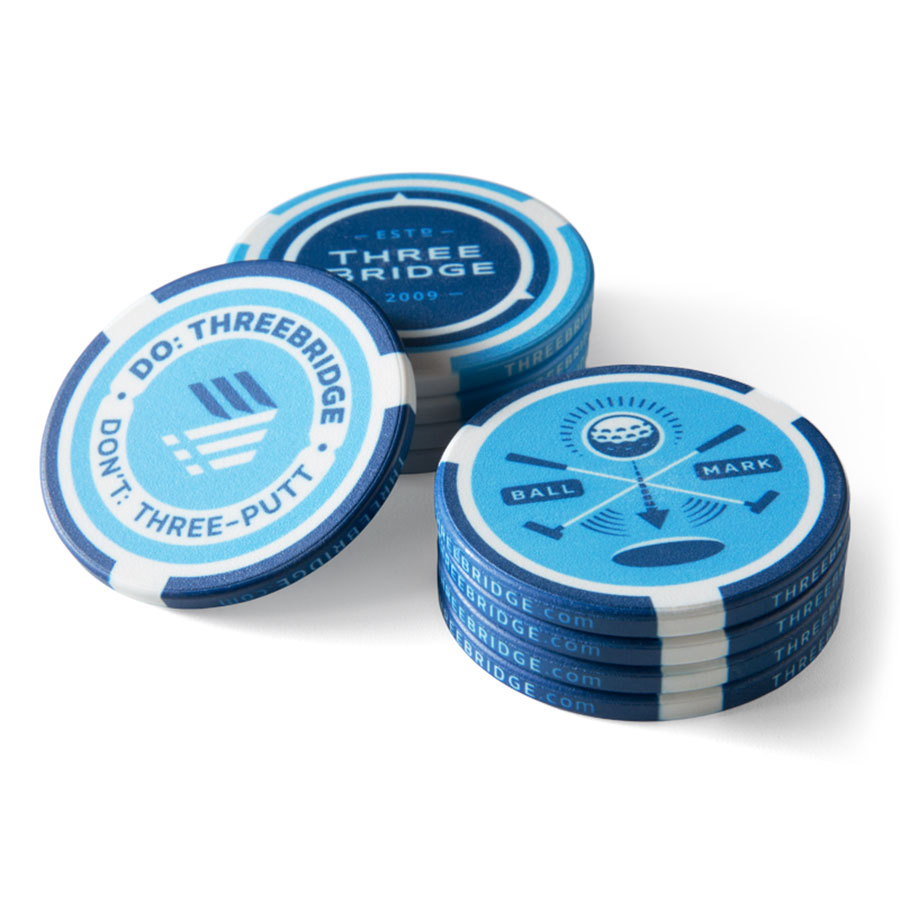
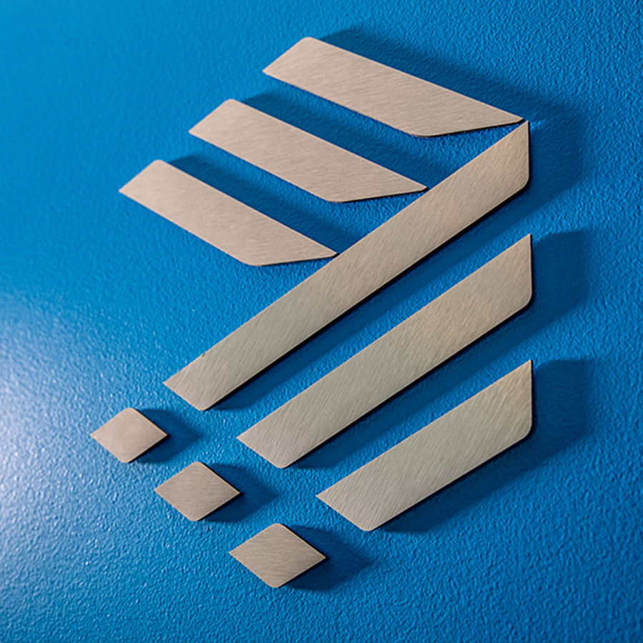
The new ThreeBridge visual identity focused on a system that supports multi-layered sub-branding. The new logo is rooted in stability and adaptability - the three lines in the logo reflect what the organization stands for: partnership for client + consultant + company.
Clarified Messaging
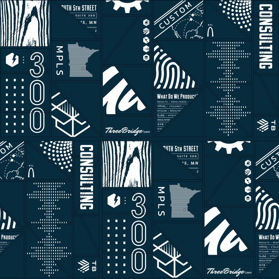
Prior messaging only stated on the company's claim of expertise. Expanded ThreeBridge messaging now articulates what their customers want, who ThreeBridge serves, and their critical difference.
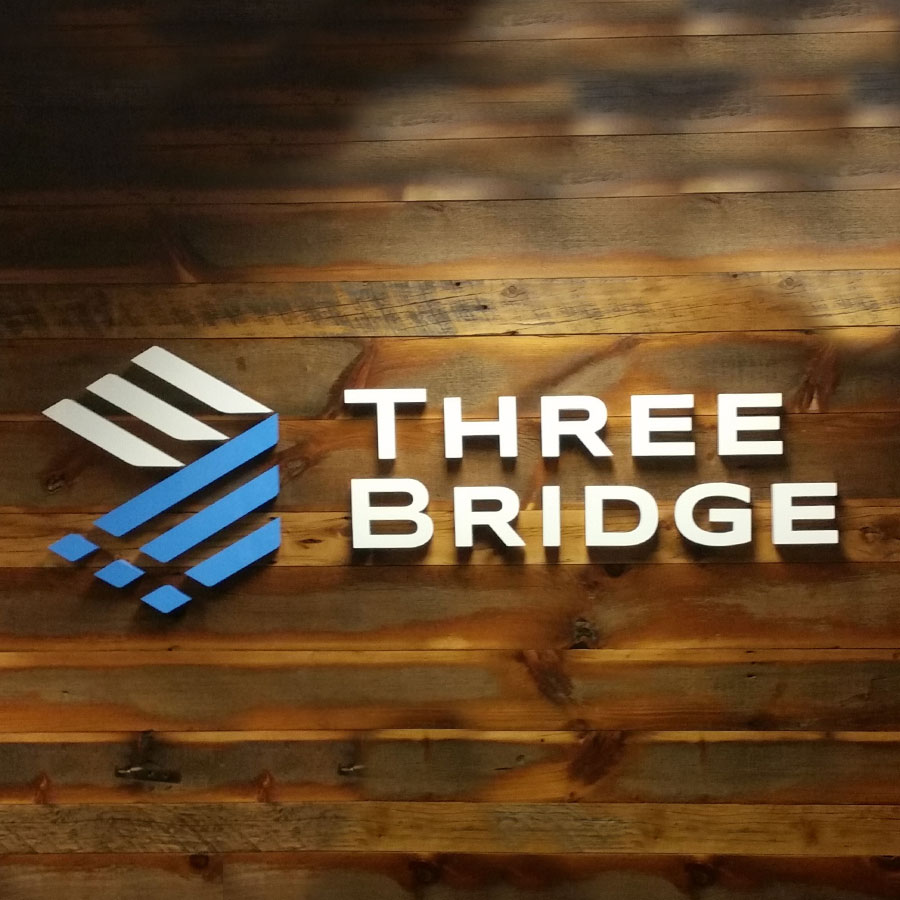
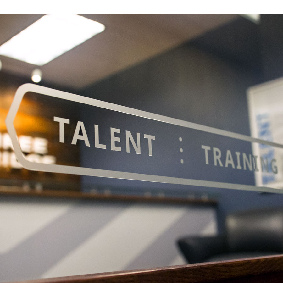
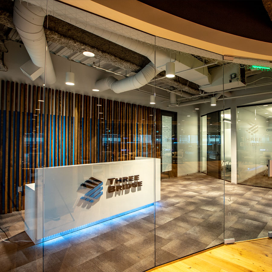
Office Graphics and Signage
ThreeBridge needed a space prospects, clients, and business partners. Their new brand now energizes the experience of being within their physical space. With just the right amount of brand messaging and inspiration, the spaces engage employees and visitors.
ThreeBridge Now Stands For
Partner-
ship
Exceeding Expectations and Growth Goals
Having demonstrated substantial growth, including launching operations in a third region of the US, ThreeBridge Solutions has been honored several times by the Minneapolis /St. Paul Business Journal’s Fast 50 in the rankings of Minnesota’s fastest-growing private companies.